In this article I'm going to explain why ignoring UX can eventually ruin your business and how UX design changes and upgrades can help improve all internet marketing KPIs such as website traffic and user retention, bounce rate, sales conversions and others.
Web designers and SEO specialists are on opposite sides of the barricade when it comes to website awesomeness and responsiveness. Designers always bet on the beauty of the website, while SEO guys and web developers prefer a more pragmatic approach where the main focus stays on simplicity and speed of performance. To better reach your business goals, it’s essential that you compromise your team of a designer, web developer and SEO specialist to work in a bundle, brainstorm and discuss ideas right on the go and make the right decisions together.
To begin with, there’re two most critical website performance indicators:
- Website load (response) time, and
- Number of clicks user has to make in order to reach target content / make a conversion.
When it comes to the latter, well thought over and proper UX/UI design can help reduce bounce rate which in its turn is an important KPI of search engine marketing (SEM).
Digi117 Case
Digi117 is our sister company based out of Vancouver, BC. Its website has changed several looks over the past 5 years and the issue with the latest design was that it no longer reflected and supported our business message and vision.
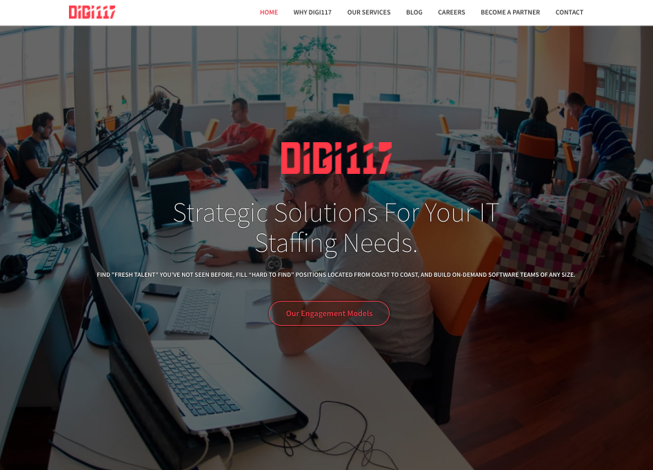
Digi117 website's homepage before redesign
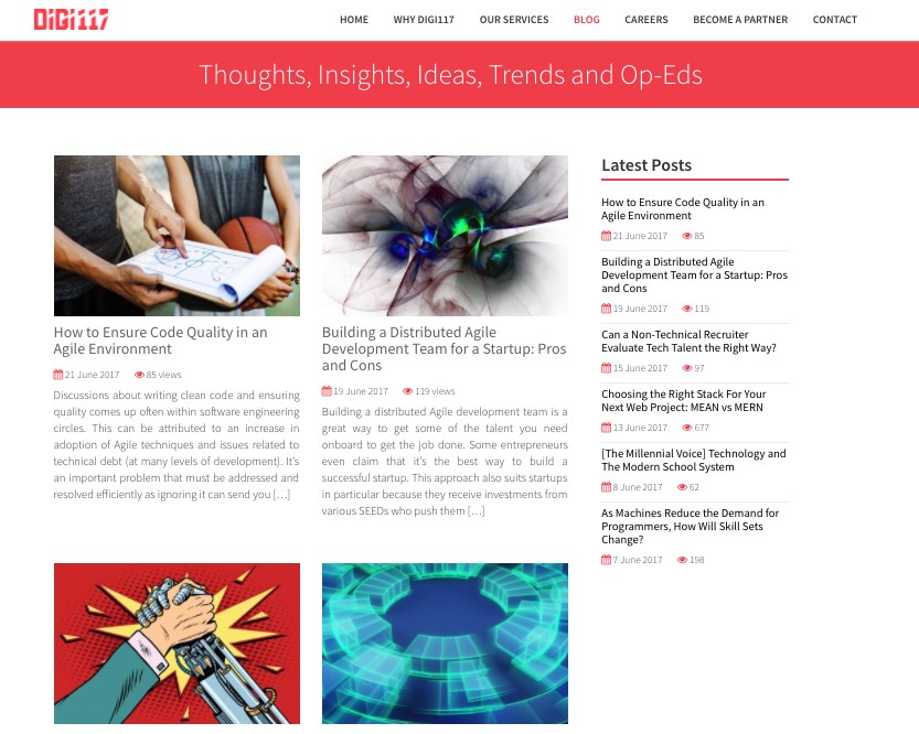
Digi117 blog before redesign
Our goal was to create an intuitive, logical and eye catching interface where each element, button and call to action will be able to ease website navigation and lead users to our contact / request forms (best case scenario, of course).
We’ve divided UX design for Digi117 into 3 main stages:
- Target user research;
- Usability design, and
- Content strategy (copywriting)
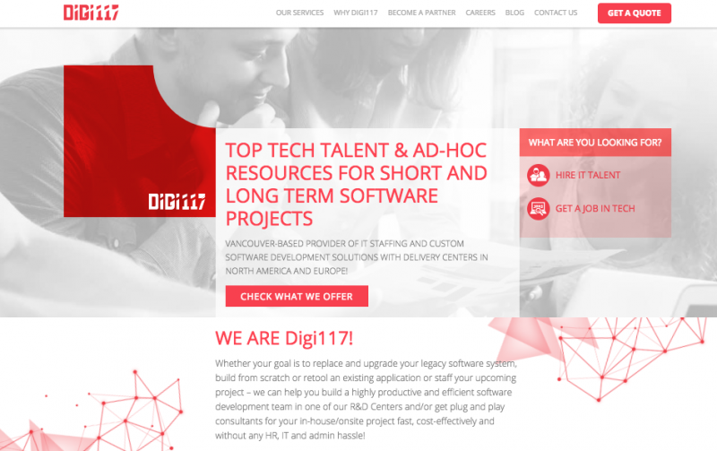
Digi117 website's homepage look after redesign
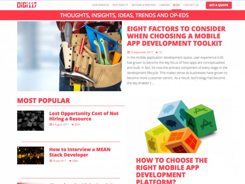
Digi117 blog: after redesign
Prior to making any design or re-design effort, make sure you and your team understand completely well that your website design’s goal is to attract new website visitors, convert them into loyalists and retain (many think mistakenly that the website's goal is to be awesome and beautiful). As such, you should have a clear vision of who your target audience is and what problems/needs your website will help them solve. Complex interface or feature creep can frustrate users which will result in a high bounce rate and lost search engine page results (SERP).
Having completed all 3 stages of UX design, we proceeded to visual design. We made sure not to overload the web pages with heavy images and used scalable vector graphics (SVG) instead. SVG graphics are textual and, thus, very lightweight.
We didn’t use any stock (preloaded or ready-made) CMS templates from a marketplace. There’re 3 reasons why:
1. Loss of uniqueness
When you purchase a ready-made template for your website, you automatically strip your design of uniqueness both for users and search engine bots. Template-based websites are hard to promote organically and SEO takes more time and efforts.
2. Most of templates are cumbersome and hard to customize
Most of website templates are created for commercial purposes and in order to capture as many users as possible. Oftentimes, there’re cumbersome functionality, heavy libraries and unclean code behind a beautiful and awesome design. You’ll realize you’ve made the wrong choice when there’s a huge downtime in your server response. And no matter how unique your template is, it won’t provide coverage for 100% of your project requirements and you’ll have to use 3rd party plugins most of which will give you a huge pain in the neck as they’ll pull in new libraries placed on top of the already existing ones, thus creating havoc.
All ready-made solutions complicate your website’s architecture and make your website heavyweight.
If you make your user wait too long while browsing your website, you’ll lose them very quickly.
3. Security
No secret that code accessibility is one of the main issues when it comes to CMS-based websites. Cyber frauds often find vulnerabilities in CMS templates and plugins and crack websites massively to access your sensitive information, malware, sell your traffic or organize junk mail blast from your server.
While CMS systems like WordPress are normally maintained and supported by a dedicated IT team responsible for bug-fixing and overall security, most of plugins are developed by 3rd parties which are hard to verify in terms of security and quality, so the risk of cyber attacks increases significantly when you deal with external tools.
Why it’s a must to upgrade websites on a permanent basis
Technology evolution is the first thing to consider. In 2016 StatCounter determined that the number of mobile users had exceeded 50% of all computer users. As such, mobile-friendly, or responsive design is an axiom rather than a nice-to-have thing nowadays.
The more devices your website is compatible with, the lower your site’s bounce rate. Search engines do pay attention to mobile friendly sites and if you lag behind with your solution, you can lose up to 50% of your potential website visitors. Guaranteed!
A long standing screen resolution standard of 1024x768 has passed into oblivion and been replaced with 1366x768 (23%) and 1920x1080 (15%) standards. Some time ago, the average website width accounted for only 980px; now we can easily create 1200px wide websites, as narrow websites don't look good on wide-screen monitors.
Also, do note rapid development of web tools such as HTML, CSS and JavaScript (JS). In the past years these technologies have seen multiple changes and significantly accelerated web design processes. CSS3 allows to reduce the number of HTTP queries and speed up page load time by reducing code lines. Shadows, rounded corners, gradients and animation are tools many web designers are well accustomed to these days.
Why it’s worth using HTML5 and CSS3 while designing websites
You must’ve heard from many experts that HTML5 and CSS3 are the future of website design. Besides new opportunities it provides to designers and front-end developers, HTML5 enables devision of page content into numerous semantic elements such as header, blog post, menu, sidebar, footer, etc. This allows search engine bots to perceive your website information the right way and improve your searchability. Also, HTML5 makes it very easy to integrate multimedia content such as video, audio and graphics to webpages, which has actually put an end to flash animation notorious for multiple bugs and unstable performance.
Since HTML5 deploys WebSockets, it loads much faster than its predecessor, HTML4. All you have to do is change and deploy new tags.
CSS3 has become more succinct and has expanded the layout features.
Specific features used for Digi117 website redesign:
1. Box-shadow и text-shadow - shadow effects for page blocks and text (see example below).

2. Opacity levels - can make any website element semi-transparent.

3. RGBA coloring - “RGB” mixes colors, while “A” sets the level of transparency, which allows to use semi-transparent backgrounds without any PNG images.

4. Rounded corners - the ability to make block edges round.

It’s just a short description of features you can design using CSS3.
Both technologies, CSS3 and HTML5, will give you a great toolkit for website design!
Post-redesign results
We rolled out the new website on September 1, 2017, less than a month ago, and we already see improvements across all of our major web marketing KPIs.
- Website traffic improvement across major parameters such as pageviews, pages per session, and bounce rate.
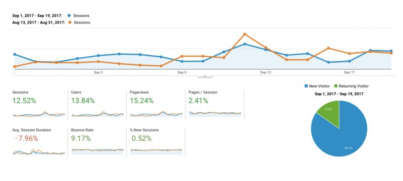 2. Website visitor performance improvement
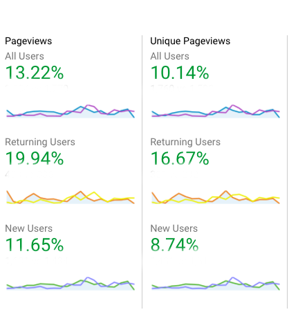
3. Our calls to action and request / contact forms have finally started working and bringing us relevant business inquiries and RFPs!

I invite you to check Digi117 redesigned website and send us your feedback and/or improvement suggestions right in the comments below!


