The purpose and functionality of software and mobile applications are at the heart of successful digital products. However, the User Interface (UI) design is just as important. This is because the visuals help bridge functionality and aesthetics and make apps approachable.
According to Irene Au, design partner at Khosla Ventures and former head of design at Google, Yahoo, and Udacity, “good design is like a refrigerator—when it works, no one notices, but when it doesn’t, it sure stinks.”
According to research, the average mobile app retention rate is just 20% after 90 days. Even worse, 21% of mobile app users abandon an app after using it once. As a result, companies need to move away from tracking app installs and focus on retention.
So while it’s still important to focus on the technical side of development, it’s also critical to apply colors and illustrations effectively to fight app abandonment.
When applying different colors to your UI designs, you also have to think about your brand and your audience. As a result, it will be a good idea to first establish a guideline for colors before you start working on a new development project.
At the same time, it’s also important to note that the growing popularity of flat and material designs makes it essential to understand color theory.
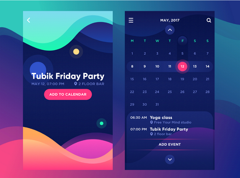
Whenever you can, it’s a good idea to use bright colors in UI design because it helps increase customer engagement. So let’s take a look at the different ways bright colors influence the end-user.
Enhances Accessibility
UI designers use bright and contrasting colors for a variety of reasons. For example, vibrant and contrasting colors can help make the application more accessible to people who have poor vision.
This is because colors that share similar hue, luminosity, and saturation can be difficult to distinguish when paired next to each other. Whenever there’s difficulty in easily identifying the elements, it can quickly lead to app abandonment.
If you decide to use contrasting bright colors, make sure that you keep it in check by converting the design or palette into grey-scale to test the amount of contrast between the two elements.
Increases Legibility and Readability

When applying colors to your UI design, you have to think of legibility and readability. If you have text within the design, the end-user should be able to easily distinguish the letters in a particular typeface and read the copy.
When you use bright colors, you can make the font more noticeable and improve both legibility and readability. However, it’s import to ensure that the copy and the background colors don’t contrast too much because that will have the opposite effect.
As a rule, it’s always better to follow the middle path and only apply high contrasting colors for highlighting certain elements.
Sets the Tone
Vibrant colors can also help set the tone and influence the end-user’s mood and behavior. Although it might be subtle, research suggests that our minds react to colors.

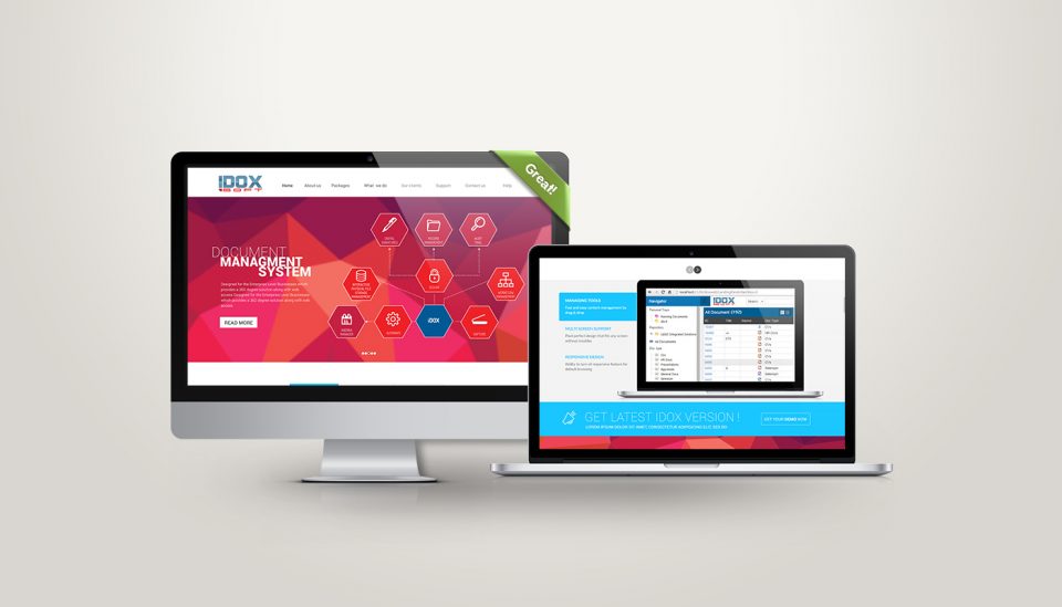
IDOX document management software website UI/UX Design. Art direction by Ramy Oraby.
The color orange, for example, is considered to be warm and energetic. It’s also said to inspire excitement. Red, on the other hand, is associated with strong, passionate, or (even) aggressive feelings.
In design, the color red is used to draw the attention of the end-user. When combined with orange, it’s said to bring feelings of enthusiasm, motivation, and love to life.
Creates a Visual Hierarchy
Bright colors also help designers create a visual hierarchy for clear and seamless navigation so the end-user won’t have to expend much brain power to find their way through the app. When the components in the UI are organized in this manner, the brain can easily distinguish the objects by the differences in vibrant colors.

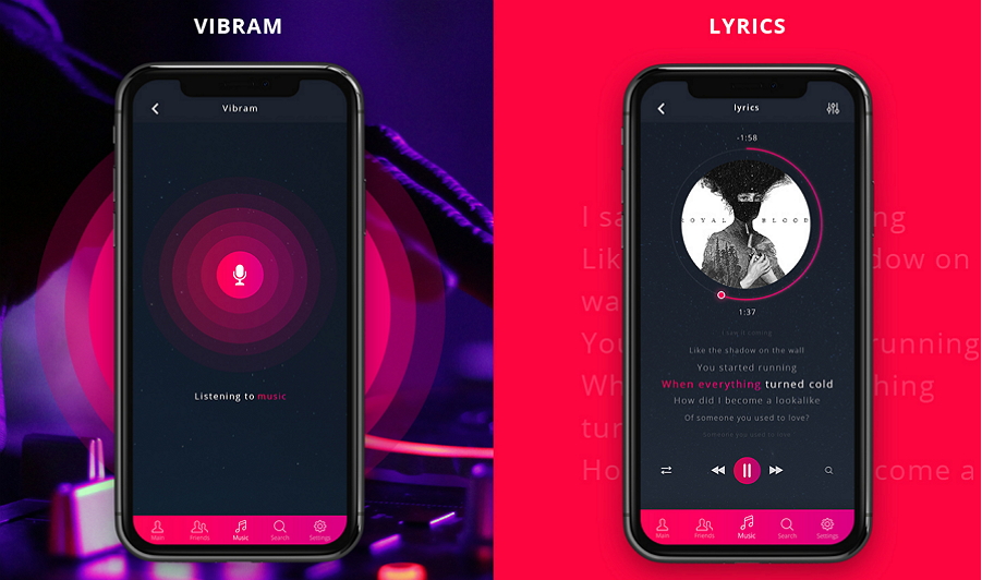
Contrasting colors in the Yono.mp3 musical app. Designers: Anton Shmatko, Green Shark Studio, Pavel Khenkin
This approach is now at the core of intuitive interaction in digital products. Colors like orange and red are considered to be strong and bold while cream and white are supposed to be weak. However, designers often prefer to use bright colors as they are easy to notice (and this approach makes it easy to highlight something like a CTA).
When the same color is used across several elements, it can also help to show that they are somehow connected. This way, people can intuitively find what they need within a matter of seconds.
It’s critical because people using apps shouldn’t have to think about they are doing. Instead, they should be able to do what they need to do to achieve their goals as quickly as possible. As Einstein said, “everything should be made as simple as possible, but not simpler.”
You will know that you have a good UI design on your hands when customers can just log in and use it without thinking. So it has to be highly instinctive!
Improves Recognizability
Our brains are wired to respond to bright and bold colors. That’s why advertisers have been using bright color combinations to grab our attention for decades.
As these colors are easily noticed and memorized, it’s a perfect weapon to implement in UI designs to stand out from the competition. However, that shouldn’t be the only reason to follow this approach. It has to be based on market research and the preferences of the target market.
If your brand already boasts bright colors in the logo and marketing collateral, it makes sense to carry these colors over to the corporate website or mobile app. This is because using the same bright colors ensures consistency and synchronicity.
While it can certainly be an advantage to leverage bright colors in the UI to increase user engagement, it can be difficult to match them. To ensure that there is some balance and harmony to your UI design, you’ll have to find a way to arrange them in a highly attractive and effective way.
It’s critical to find harmony in your color combinations to not only make a good first impression but also to keep them coming back. Let’s face it, when colors clash it’s not pretty to look at, and this can lead to rapid app abandonment.
So before you start working on your next development project, it’ll be important to think about highly effective UI design that can help negate app abandonment.
If you need help with UI design for your project, reach out to one of our in-house design specialists.


