Last Friday, Apple received almost 1 million pre-orders for Apple Watch from the United States alone, which is a clear indication that the company is off to a solid start of a new product journey. We're yet to see whether this journey will be as successful as the journey of its other products and whether Apple Watch really has what it takes to revolutionize the era of wearable tech whose onset we're lucky to witness these days.
Having interviewed some of our iOS developers and UX designers (who already experiment with apps dev for Apple Watch on their pet projects), I compiled a list of major factors that should be taken into account when planning Apple Watch application development project.
So, what kind of apps does Apple want developers to build for their groundbreaking wearable gadget?
In Apple's view, Apple Watch apps should ideally supplement, but not replace iOS apps we're already well accustomed to. We, users, should be able to interact with them within seconds, not minutes, and the apps should be synced to our iPhones, except for some native Apple Watch apps such as a watch app, maps, timer, etc. Well, in this way Apple is obviously trying to bind us even more tightly to the iPhone and increase Apple Watch usage lifecycle. However, according to the Watch Kit, Apple will have allowed developers to create fully autonomous and standalone applications by the end of 2015. More about ios app development in Chicago.

Apple has distinguished the 3 key principles of UI design for the Watch.
Personalisation - Apple Watch is meant to interact with us as closely as no other device has ever done before!
Integrity - Apple Watch is meant to erase the line between digital and physical worlds, and how to do it as seamlessly and enjoyable for users as possible is a challenge Watch OS developers are yet to overcome.
Lightweightness - Apple Watch apps should be simple and laconic, and thus should have minimalistic UI design and the ability to provide us with lightning-fast access to information.
These are the 3 pillars that any UI design for Apple Watch apps should be based on.
Navigation
Hierarchical navigation is best suited for apps with tree data structures and should be used for design of more complex and cumbersome apps.
Page navigation should be used for designing apps with little data; this type of navigation is best implemented via horizontal swipes. Yet, the fewer pages the better is a rule of thumb to follow!
Modal interface is best for Apple Watch apps that aim to help us make a choice or complete a task. However, all modal interactions should be minimized.
Gestures and Interactions
Apple Watch has certain restrictions in regard to data inputs or information viewing. Besides standard interactions such as swipes, taps and scrolls, Apple Watch supports a firm press that calls context menu in the current screen (no more than 4 buttons!). Besides, the Watch provides glances that are called by swiping up on the lock screen and display the most important information from several apps (e.g., weather app, geolocation, stopwatch, etc). Glances are listed by swiping up, that's why Apple recommends featuring only the most important information in them and avoiding scrolling screens. Glances also contain two analogue buttons: a Digital Crown wheel that allows for lists scrolling and items ticking , and a button next to it that launches Friends app with one click and allows using Apple Pay with double click.
Notifications
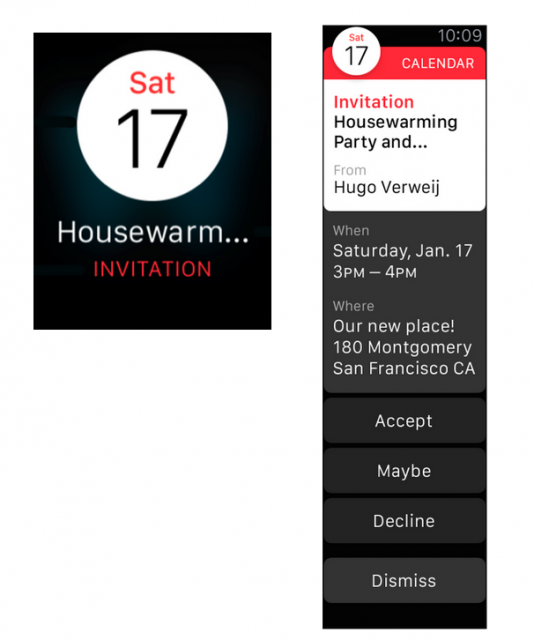
In Apple Watch, all notifications from apps are divided in 2 types: short-look and long-look notifications. Short-look notifications pop up each time a Watch user raises their hand to look at the display, and have a unified look - an icon, app's name and a very short text. They should fit in one screen and disappear right after the user lowers an arm.

Long-look notifications pop up when the user keeps looking at the Watch for quite a while or taps on the screen. They can scroll and contain some additional content (e.g., a picture), but no more than 5 buttons (e.g., close, like, comment, etc.).
Apple Watch is also fitted with Taptic Engine, a linear actuator that produces haptic feedback. By the way, we can even send our heart rhythm to friends using this Engine.
Fonts and Colors
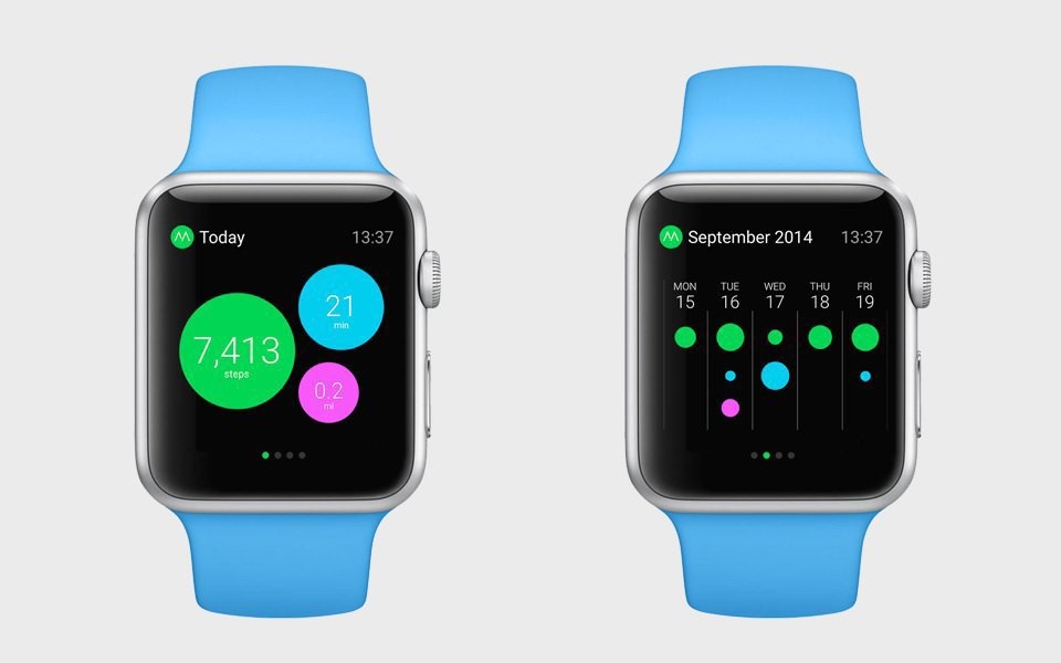
Apple recommends designing apps with black background to ensure high contrast ratio and create an illusion of the absence of fields. Yet, it's recommended to use contrasting colors for text and app elements. For their Watch OS Apple created a San Francisco Display font with 9 levels of saturation and outline that saves horizontal space.
Position of elements

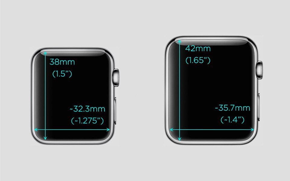
Since Apple Watch will be available in two different sizes, on-screen elements position is not fixed, but relational. Apple recommends that all elements are positioned upside down and from left to right, all buttons have full screen width, and all secondary actions are hidden in the context menu.
Animation
Right now Watch OS doesn't allow for creating animation, nor does it support video. However, it doesn't mean the apps will be static. Designers will be able to animate apps with help of succession of images. Also, Apple Watch maps can be of two types: interactive and static. In apps design, it's recommended to use static images with up to 5 tags.
Branding
Apple Watch apps developers should focus on the general look and feel of their apps in order to create memorable user experiences. Use of custom colors, fonts and icons can help achieve this goal. Yet, they shouldn't contrast with the standard elements.
UI Elements
Watch UI elements include labels, images, groups, tables, buttons, switches, sliders, maps, dates, timer and menu. As mentioned above, all buttons should be formatted to fit the screen width; otherwise, one line cannot contain more than two buttons. Labels can contain a few lines of static text. Groups are used as the main method of structuring content in the app; they allow showing repeated elements both vertically and horizontally. Tables help structure content by means of columns and rows. Buttons are action triggers that can contain a label or a group element.
Icons and images
All square icons should be optimized for @2X resolution (for retina displays) and sized differently depending on the Watch diagonal. Homescreen icons should be 172 px for a 38mm device (screen resolution = 272 × 340 ), and 196 px for a 42mm device (screen resolution =312 × 390). In both models, the aspect ratio will be the same - 4:5.
For more information about Apple Watch apps development and UI design please follow us in Twitter and LinkedIn - we'll be sharing a lot going forward!
Sources: Forbes.com; images - Apple.


