A well-designed product or website will never fail to become part of the users’ lives and make them feel like they have been using it forever. Creating a product that is immediately accepted by the target audience represents the motivation for any UX designer, but it’s not an easy job. Apart from an exceptional design talent and effort, UX designers should also know psychology principles that can help them better engage their audience.
The following five principles will help you design better digital products that work for your customers.
1. Mind the Principle of Least Effort
As the world becomes busier and distractions are everywhere, people tend to be attracted to those products or websites that require minimum effort from their end. They want to avoid repetitive and tedious work as much as possible. For instance, the auto-fill feature included in browsers has solved many users’ problem by remembering their username and passwords faster and easier.
What should a UX designer or a startup founder learn from this? When creating the final product for your target audience, you should keep in mind that people are extremely busy nowadays. For example, one of the best practices is to make a sign-up/login page as effortless as possible. And always remember, that the user should be able to find information on your website or app easily.
2. The Text Still Rules the Game
One of the biggest UX trends for the past couple of years has been related to strong and meaningful visuals. However, if you think from the psychological point of view, the representation of text is also extremely important. Why? When you combine a short and well-written text with a strong image, you can tap into your audience’s core emotions and make them loyal to your brand.
Work with your copywriter or marketing team to create a memorable and powerful message that will resonate with your audience. Give your users clear instructions and use proficient writing tools for a flawless and targeted text. Make the message stand out with both aesthetic and the quality of content.
3. Never Forget That Human Memory Is Not Reliable
Human memory can play tricks. From a UX designer perspective, a successful product is the one where users have the least cognitive load while they use the product. Therefore, the website should be designed in such a way that users don’t have to remember the steps they have to follow every time they use your site or app. When you don’t bombard users with tons of information all at once, then you have won your target audience.
How can psychology help you? Take the example of Duolingo and see how they manage to make their users do exactly what they want them to do.

Duolingo used distinctiveness by making their informative and guiding text stand out amongst all the other visual elements on the page. They also use primacy by presenting the most important information first. Moreover, they also repeat certain messages as much as possible and create flows of information on many pages so that their target audience understand exactly what they have to do.
4. Pay Attention to Colors
The colors you use for your website can influence its success or failure. Colors are a very powerful psychological tool which can attract your users’ attention and influence their mood. In addition, colors can dictate your audience’s behavior and help them interact with your website easier and faster.
For example, have you ever wondered why all sales or action buttons are colored in red? There is a psychological answer behind it. Red is the color of action and it encourages visitors to immediately click on it and see what comes next. On the other hand, red is not the universal color for sales buttons. You should first know your target audience personality and define the color that works best for them. For instance, you can use blue color to inspire honesty and security.

5. Don’t Forget About Hick’s Law
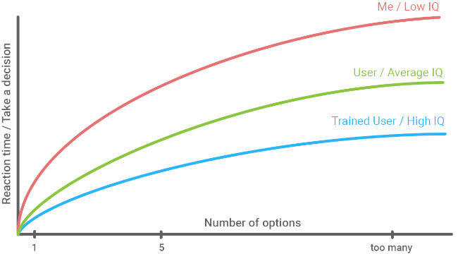
Hick’s Law is extremely simple: the time spent by your audience to make a decision is directly influenced by the number of options you are giving them.

This means that whenever you tend to overload your users with huge volumes of information, you should think of this law and make things easier for your audience. The fewer options you give your audience to choose from, the less time they will spend on your website until making the buying decision.
It's not easy to get things right from the first time, though. Test different options and find out what works for your target audience best. To make things easier, you can use the best practices of software testing. For example, check tutorials and keynotes by the EuroSTAR speakers.
Creating a popular application or website is all about understanding your target audience and getting into their heads. UX design has its roots in cognitive psychology, after all. Therefore, knowing exactly what your users want from you will help you organize your information and use the right visual effects to give them exactly what they are waiting for.
Applying the psychology principles above will definitely improve your users’ experience. Learn from the feedback and spend time to get to know your audience better. Then use all these learnings in your future projects and make your audience loyal.


